Create a brand out of a new food product
and introduce it to the German market
MING Labs Case Study: Pumperlgsund – The better half
Pumperlgsund: The better half
How we turned a bottle of egg
whites into a health food brand
The company got funded by Frank Thelen, a famous
German investor. More than 500,000 bottles sold so far.
The website won plenty of awards, and our bottle design
won the Red Dot Design award
Naming, branding, creative direction, research, packaging design, web design, web development
In 2014, Jan and Fabian, the founders of a yet untitled company, noted a new trend: people conscious of their diet and eating habits were eating egg whites. A lot of them. The egg white is extremely rich in protein, and, according to some studies, contains protein of the highest quality.
The problem is, of course, that you couldn’t buy egg whites anywhere in Germany — so your only option was to buy eggs and throw out all the yolks. Jan and Fabian came up with the idea to sell just the egg whites, and they approached us to work together on the product launch — which included naming, packaging, branding, website, and so on; the whole thing.
There were a couple of difficulties at play here. First, the egg white — a translucent liquid — doesn’t look particularlyand some might say it’s outright off-putting appealing, visually speaking, so we had to come up with a way of showing the product in some other way. Second, the audience wasn’t really familiar with the product, with the idea of buying just the egg whites, so we had some explaining to do before we could convince them to buy this.
As luck would have it, we started from a blank slate, having absolutely nothing at the start — except for some egg whites to taste. Not even a name. After a couple of iterations, we settled on Pumperlgsund, a beautifuland impossible to spell without typos word from Bavarian German, roughly meaning "perfectly healthy”. Indeed, it’s the idea of healthy eating that the founders wanted the name and the brand to carry.
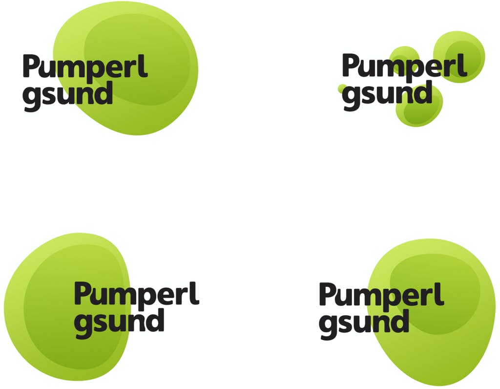
The visual identity followed the same themes of health, organic bio food, so it’s all green, obviously. The generative logo imitated the egg, and the animations reflected the liquid nature of what we were dealing with, showing the physicality of the product in pixels.
A lot of effort went into the packaging. The egg whites are sold in bottles, and we wanted the bottle to somehow hint at the nature of what’s inside, and also to stand out when placed on a supermarket shelf.
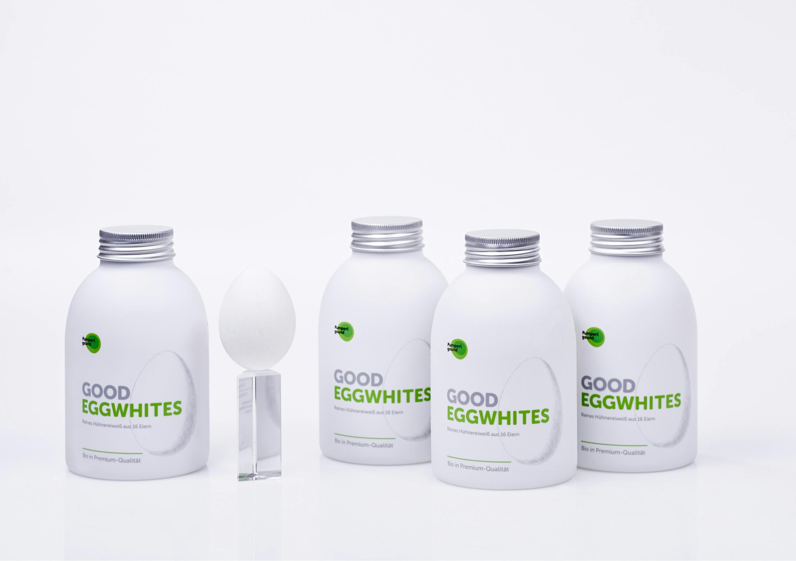
We faced many questions when on the search for the perfect packaging: What is the perfect bottle shape? Glass or plastic? Transparent or opaque? What kind of cap should we use? We studied over 30 different bottle shapes, testing for qualities like: the ease of pouringhow foamy does the bottle make the protein, how fast does the liquid pour?, robustness, and whether it was possible for the bottle to visually represent the product.

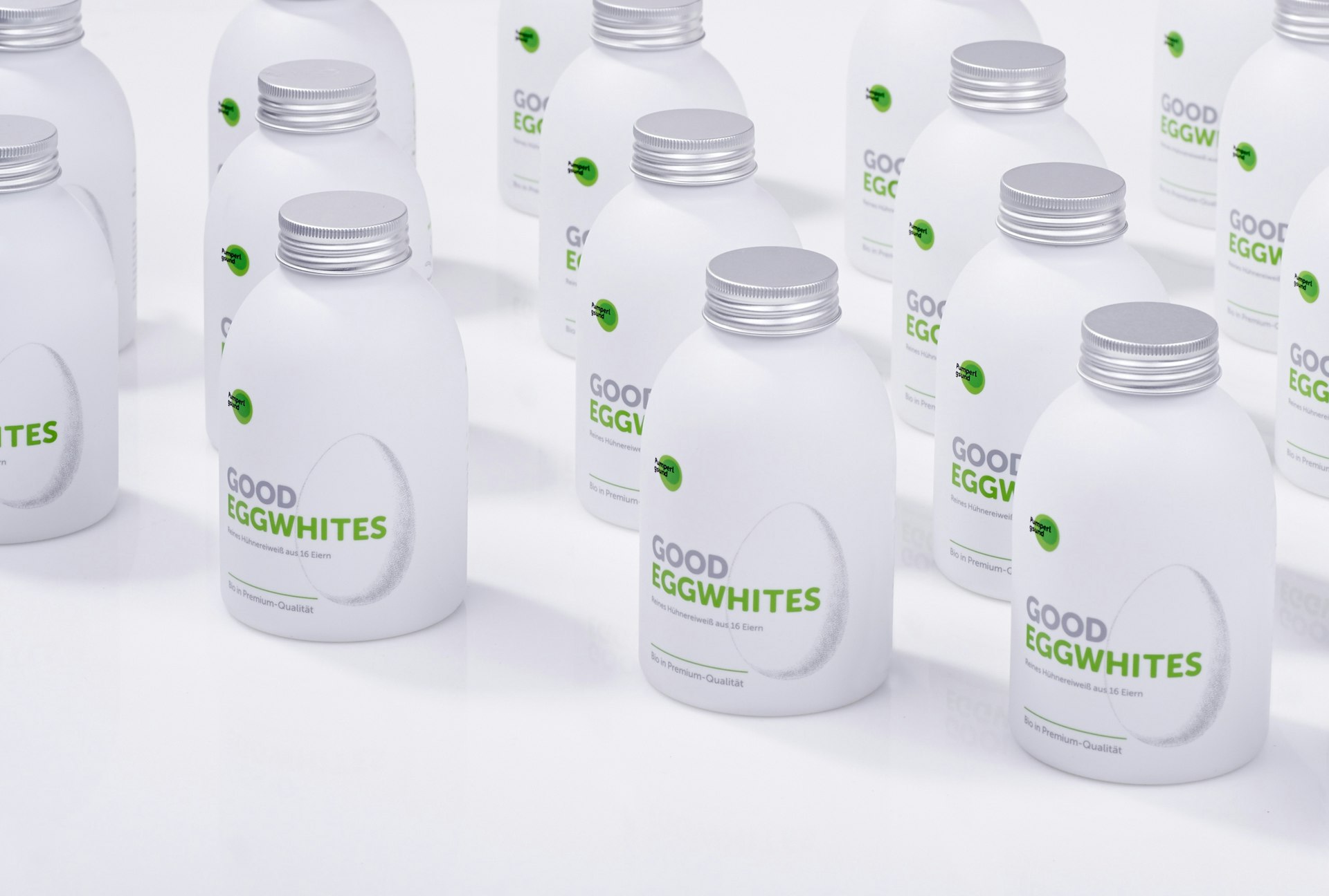
The pot-bellied shape of the bottle that we ended up choosing was derived from the egg, and the rough, uneven texture of the bottle material is also similar to the eggshell. The bottle turned out to be a little transparent, making the amount of the egg white inside clearly visible.
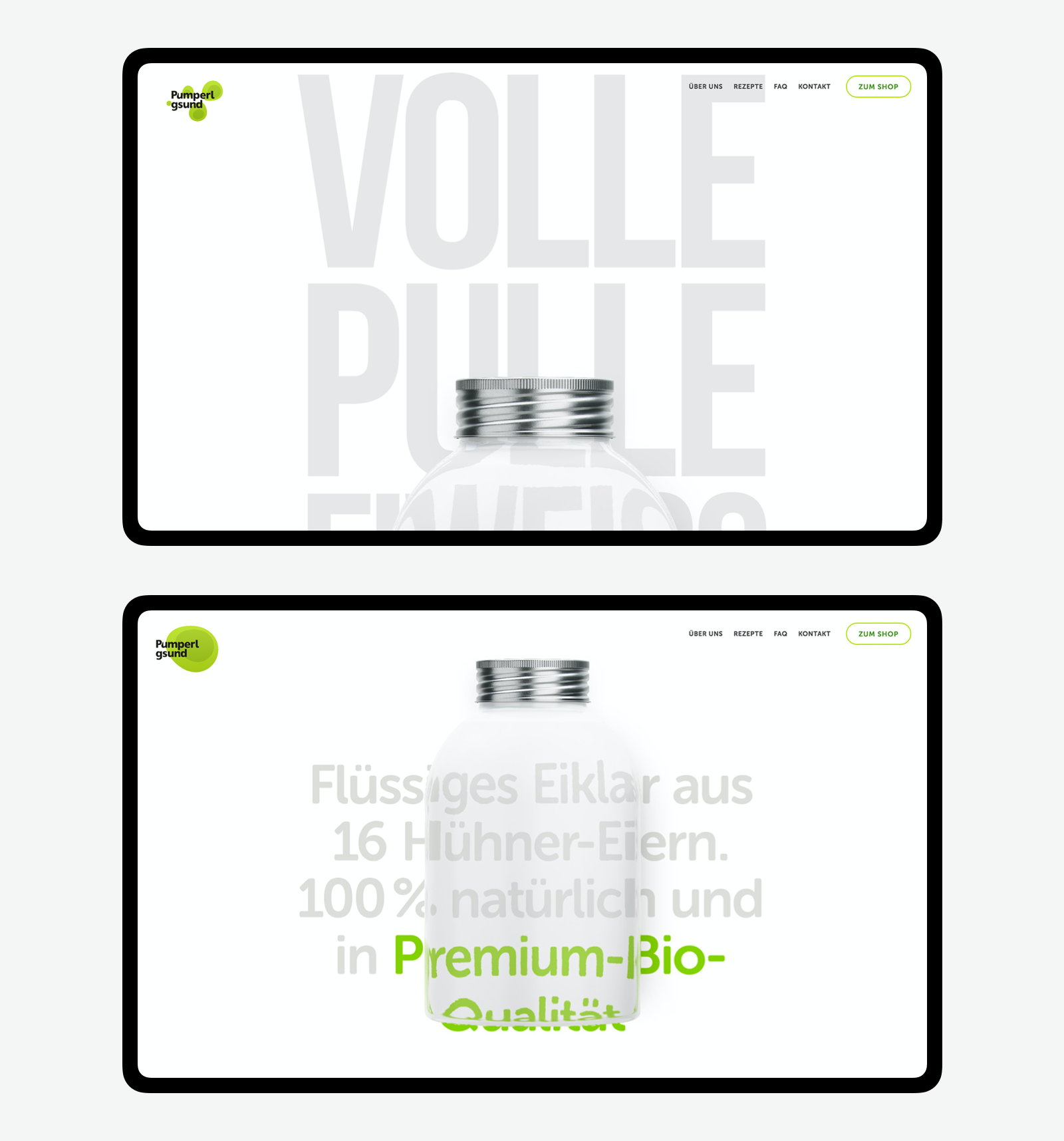
Now that we had a tangible representation of the egg whites — the bottle — we could start with explaining the product. What is it, why is it good, and so on. The idea was to turn the bottle into the hero of the story, and to place it front and centerliterally, showing various parts of the bottle while simultaneously telling website visitors about the egg white. Oh, and you could order the bottle online, too.
To show how egg whites could be used, we created an entire section with recipes of all kinds of meals that you can cook using egg whites. To develop this collection of recipes, we relied heavily on the UX research to better understand what exactly people are looking for.
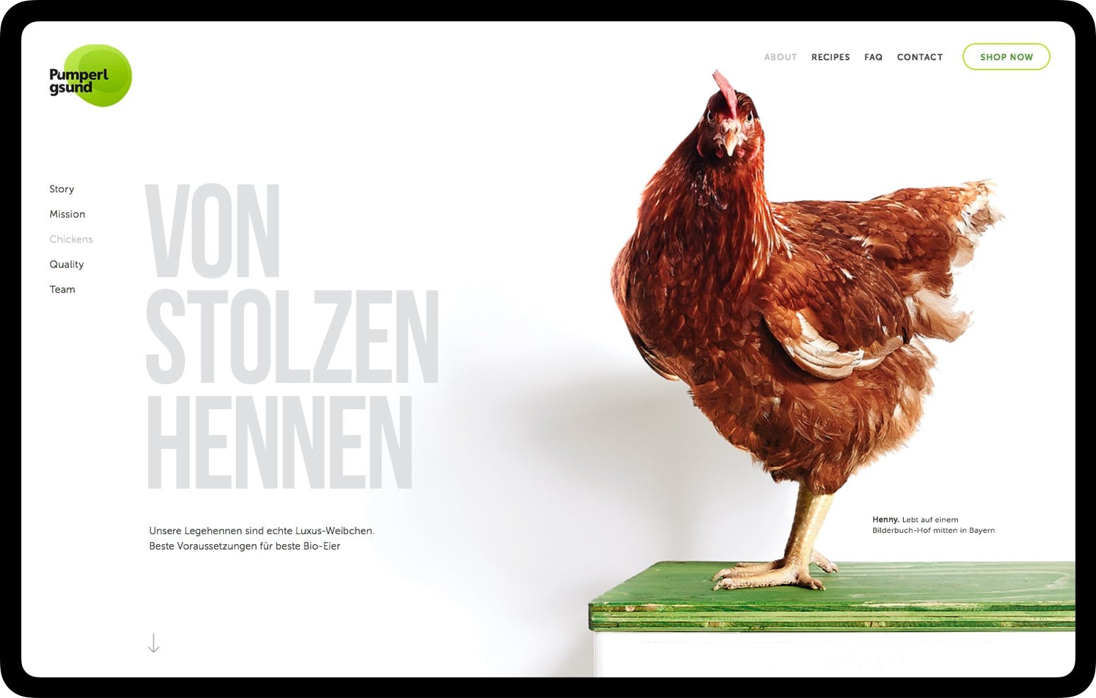
Last but not least, we placed the real hero of the story on the website as well — the chicken from the farm where these eggs are harvested.which is, by the way, subject to the highest standards of the industry, ensuring all very ethical bio production. Meet Henny:
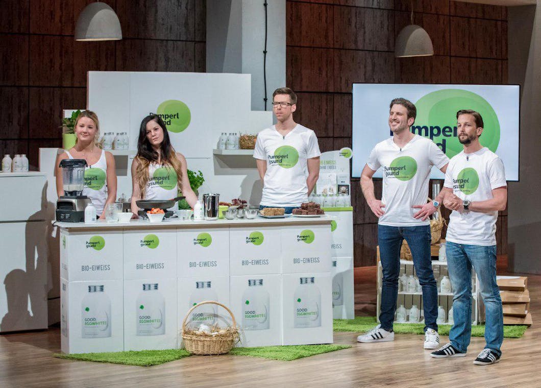
Pumperlgsund was launched, and the launch was successful. The founders got invited to a German TV show, the local version of “Shark Tank” / “Dragons’ Den”, and won €500,000, and Frank Thelen, a German serial entrepreneur and investor, immediately offered them a deal.
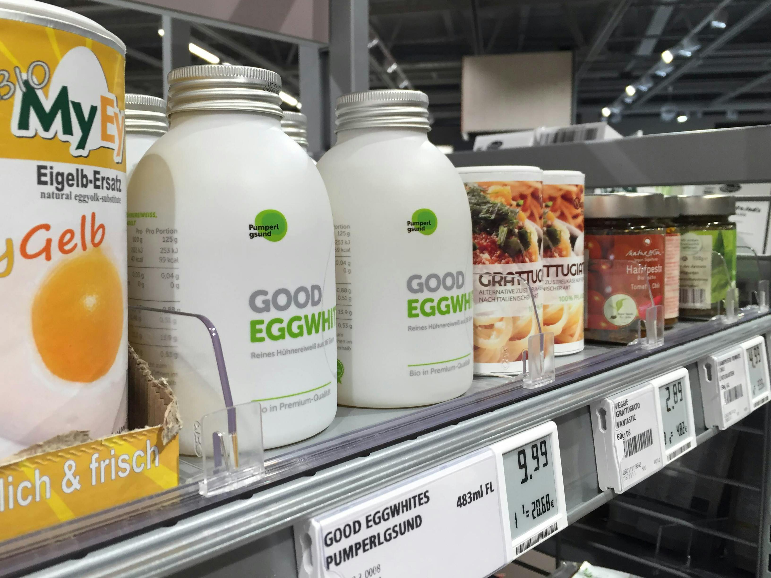
The egg whites soon appeared on the shelves of major supermarket chains — and indeed, they looked rather good. The last time we checked, Pumperlgsund sold over 500,000 bottles, which roughly amounts to 5 million of eggs the yolks of which were not thrown away.
Meanwhile, while the founders of Pumperlgsund were enjoying their fame and success, we were having a moment ourselves. Both the website and the packaging received a number of awards. Which is always a good thing.
- Red Dot Award: Winner 2016 in category ‘Communication Design — Packaging Design’
- German Design Award: Winner 2018 in category ‘Excellent Communications Design — Web’
- Awwwards: Site of the Day on April 23, 2016
- CSS Winner: Site of the Day on June 16, 2016
- Webby Awards: 2016 Honoree in category ‘Food & Drink’
- The Lovie Awards: Silver Winner 2016 in category ‘Food & Beverage’
Pumperlgsund GmbH: Jan Göktekin & Fabian König — founders; MING Labs: Marc Seefelder — creative supervisor; Matthias Roebel — strategy advisor; Sergey Skip — design lead, web designer, packaging designer; Christoph Gromer — packaging designer; Gerhard Seitzer — packaging designer; Pavel Zyr — developer (landing page development and special effects); Martin Balfanz — chief technology officer; Biliana Valeva — developer/senior software engineer; Henning Müller-Dannhausen, Kristina Würz — copywriters; Stefan Hörmann — project manager.