To come up with a way to
control a not-so-usual lamp
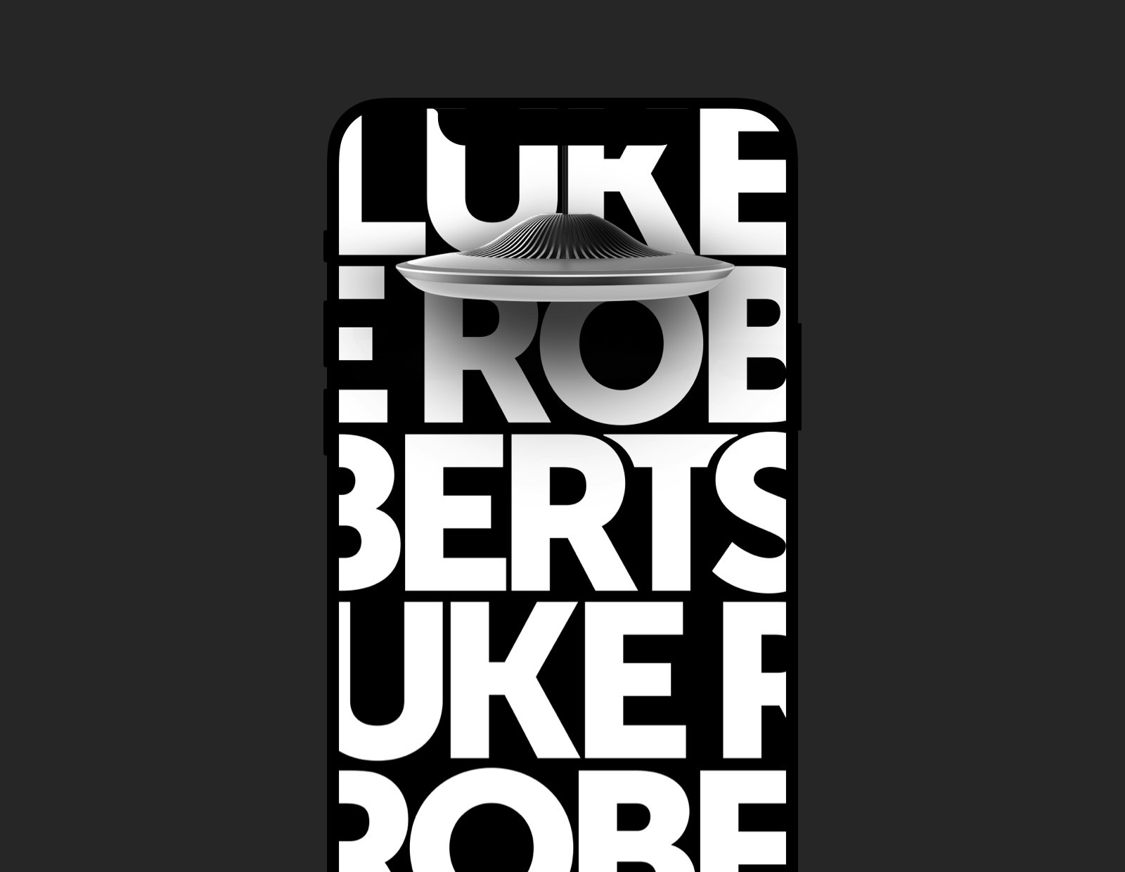
MING Labs Case Study: Luke Roberts – Painting with light
Luke Roberts: Painting with light
How we designed an app
for a smart LED lamp

The app on App Store. The very successful €400k Kickstarter campaign. The lamp on Amazon (which we had nothing to do with, but still)
UX design, UI design, prototyping, art direction
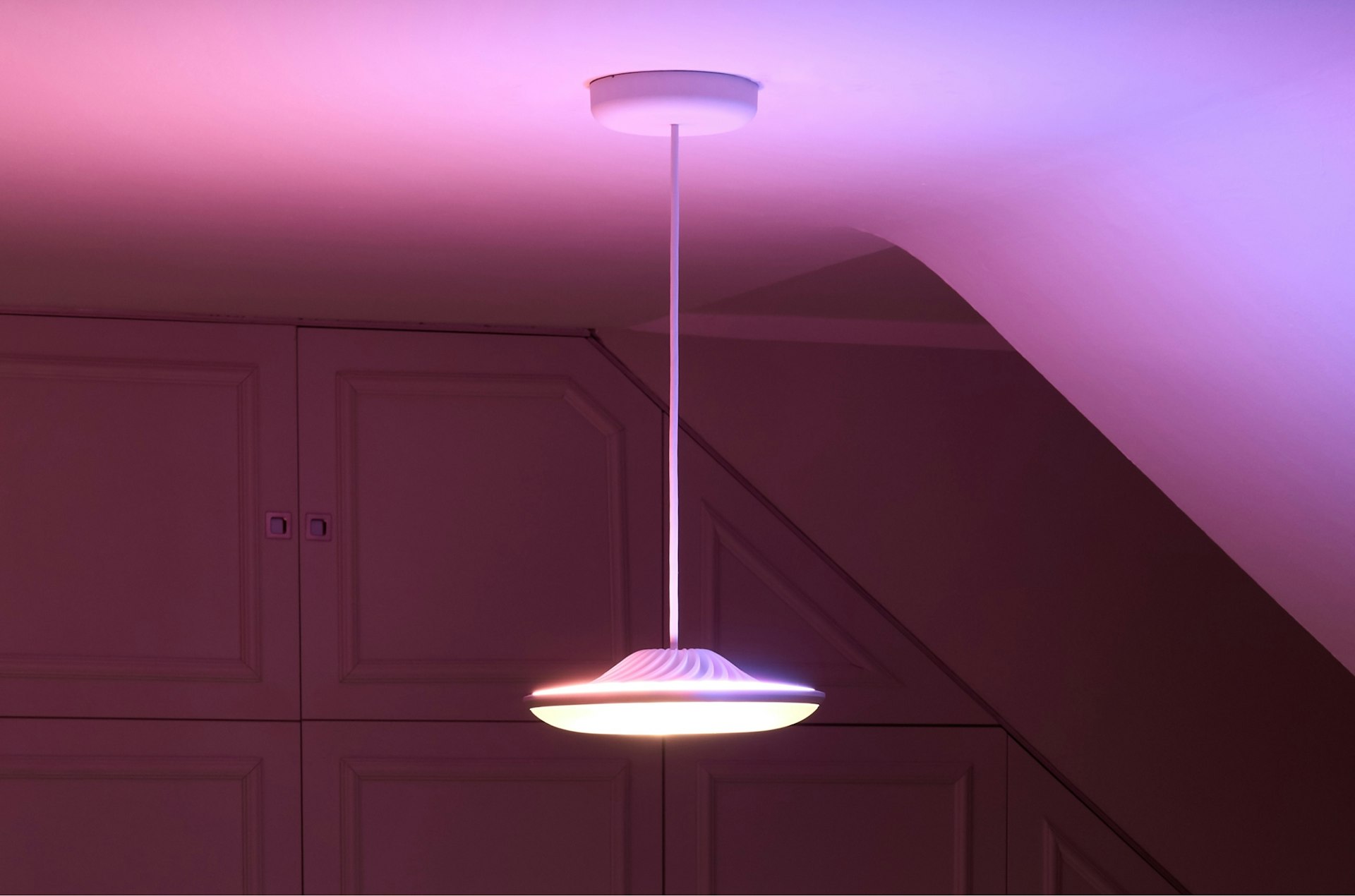
Lukas Pilat and Robert Kopka were designing a different kind of lamp: a lamp that would make it possible to set up the light in a room just so — color, shape, direction, intensity, etc. With a regular switch, you can’t quite paint with light:as we poetically call it You need some kind of interactive medium, such as the one that you have in your pocket or purse (unless you’re reading this story on it — in which case it’s definitely not there but in your hands). Indeed, the idea was that you’d control the lamp with a phone — and it is with this idea they approached us to experiment and find a suitable, unconventional, pleasantly surprising way of doing so.

When we started working together, Luke Roberts was a startup in its true sense: It was just two guys, an engineer and a marketer, working on a prototype — there was not even a prototype at that point — who wanted to create something entirely new, and Very Different from other lamps out there. Although it might sound like a cliché, they were passionate and dedicated and otherwise delightful to work with.
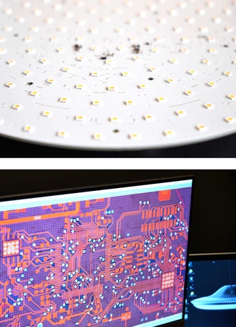
Technology-wise, their idea was to use 200 LEDs in total, some at the top, some at the bottom, that would generate any light in any directionin 2014, that is. According to our knowledge, nothing of the kind existed at the time. It was an ambitious, riskypardon the big words and technologically challenging endeavor: As with all innovations, it’s quite impossible to predict up front whether you’ll succeed or not. Same with design.

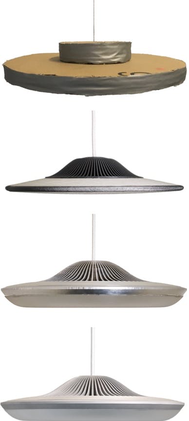
This was not a typical “here’s a brief” project — on the contrary, it was more of an experiment. It was not entirely clear at that point what the technology would be (and would not be) capable of; the brief was more on the side of “let’s figure out what we can do with this”. Which is, naturally, quite exciting. Throughout the project, we closely collaborated with the lamp makers to strike a balance between our creative fantasies and the technological constraints.
When we started working, we only had that crude prototype, and incredibly incomplete knowledge of the technology and the end result. Over time, as we were refining the app, Lukas and Robert were refining the lamp, and gradually the two started magically converging and looking like a real product. We both wanted to make Something Quite Good. We hope we succeeded. Or didn’t fail at least.
The app was built around two ideas. First, presets: the notion that you’d need different light setups at different times — frustratingly bright light to wake up in the morning, soft ambient light to watch TV in the evening, etc. Second, gestures: We quickly got rid of buttons and lists and otherwise all too familiar UI controls in favor of a more fluid and physical visual language. (Apps for painting and composing music were our primary references.) The centerpiece of the app was a color picker, allowing lamp owners to almost literally paint with light.

With the intention of replicating the real-worldness of the lamp, the physicality of light, some particular attention was paid to making the app look life-like, as far as pixels permit. The interactions, transitions and every microdetail were first designed in motion, and then replicated in the development phase. It’s probably best to show animations instead of talking about them.
This might be subjective, but somehow this very simple process of moving your fingers against the cold glass of the screen and seeing the “paint” move and seeing the light change at the same time is incredibly soothing, calming and satisfying.
Luke Roberts debuted on Kickstarter to raise funding for the first batch of lamps. At the time, it was the most successful tech Kickstarter campaign in Europe, raising over €400k, the original goal eight times over. Of course, it probably has much more to do with the lamp than with the app, but we like to think that the app had a bit to do with this success as well.

Nothing quite unusual here, as this is quite typical for each of our projects, but in case you're curious:
- Identifying the consumers and their needs
- Usage scenarios
- User stories
- Converging the functionality with the technological constraints
- Sketches
- Wireframes
- Visual design
- Interactive prototype
- App prototype development
- Working with a physical device is great fun — but not without equally great difficulties
- Designing an app for a not-yet-existing, currently-in-the-works device is hard, but not impossible
- Tight direct collaboration with the makers of a product is both rewarding/enjoyable and leads to the best results
- Finding the right visual language to complement the design of the lamp itself, so that the two would feel like one singular product, was a good, non-trivial exercise
- Light is everything!
Luke Roberts: Lukas Pilat & Robert Kopka — project leads; Arvid Klang — software development; MING Labs: Sergey Skip — design lead, UX & UI designer; Erica Salvetti — UX & UI designer; Klaus Zimmermann — UX designer; Peter Zoell — project manager; Jeroen Jonkers — project manager; Marc Seefelder — CCO.