Create an easy-to-scale sustainable web template for all campgrounds in the Camping Lodge family
MING Labs Case Study: Camping Lodge – The future of sustainable travel
Camping Lodge greens your vacation
How we designed and developed a low-carbon website for tourism
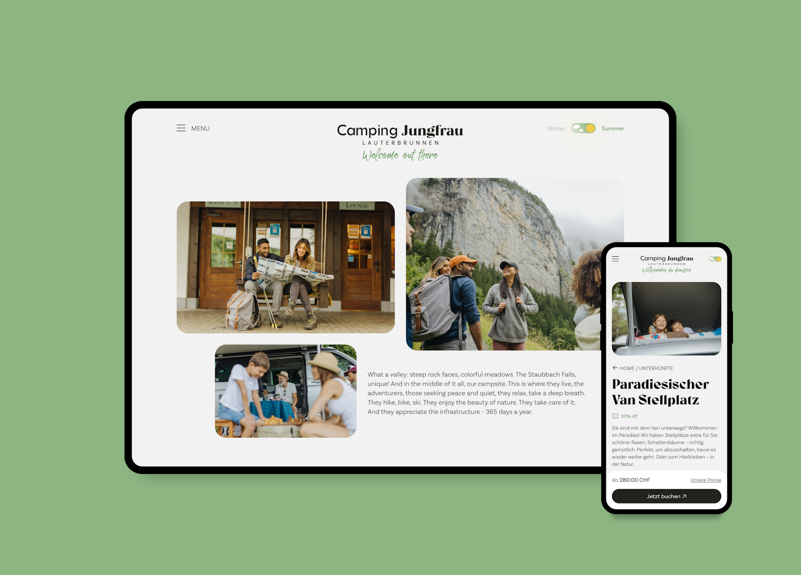
We launched the first three green websites — pioneering the camping industry and helping protect the planet with 75% less CO2 emissions per page view
Concept, art direction, photography, UX/UI design & web development
Everyone likes to believe that camping is sustainable. In fact, it’s not. From single-use equipment to off-roading – there are a lot of things that make camping not as low-impact, in-close-touch-with-nature as you think.
Luckily, there are mindful people out there who are committed to changing that. In this case, René and Jan, the founders of Camping Lodge AG — a Swiss company aimed at revolutionizingno less the unsustainable camping world. Their vision is to bring together a number of campgrounds under the umbrella brand of Camping Lodge, with each campground following eco-friendly practices. Camping in harmony with nature, for real.
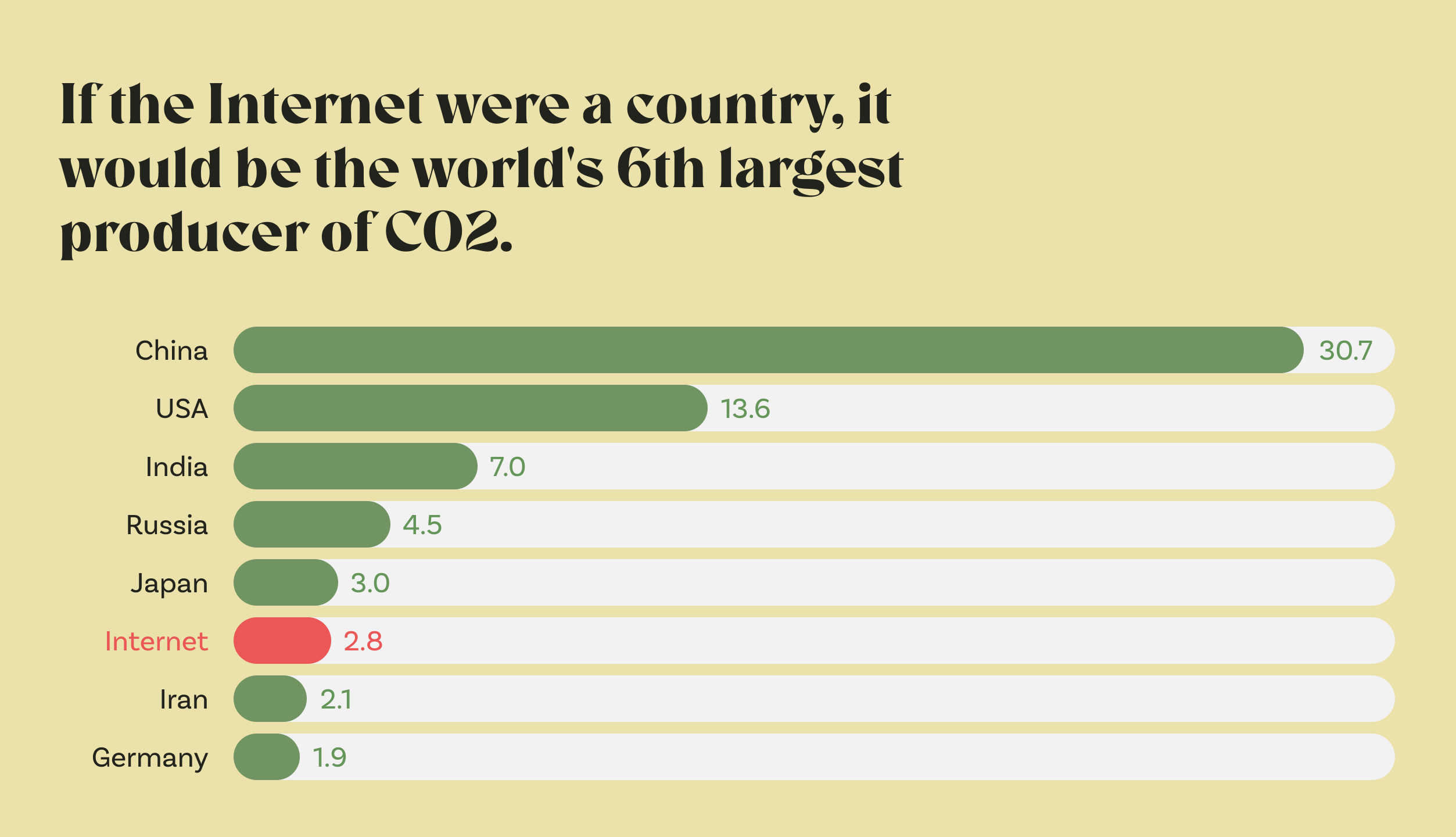
If it was a country, the internetdata centers, networks, end devices would be the 6th largest polluter. (Or 7th largest, depending on who you ask, but in any case, it’s BIG.) By 2025, communications tech will emit more carbon than any country except India, China, and the US.
A single web page consumes on average 1.76g CO2 per page view. Multiply that by the number of visits you make throughout the month…yep, that’s quite a lot.
It’s obvious that this needs to change. And indeed, there is a growing awareness of the impact digital products have on the environment and a recent movement to make more eco-friendly products.
When Camping Lodge takes over existing campgrounds, they follow a sustainable approach throughout. They’ll keep the employees and sustainably refurbish the infrastructure, all while embracing a pragmatic method of sustainability: Keep what works, change a little at a time. From procuring local products to using environmentally friendly items and green energy.
Camping Lodge approached us to design a white-label solution for their various locations’ websites. But wait. How would thisthe web being a power-hungry monster align with their eco-friendly business model?
During our first conversations with Camping Lodge, we literally fell in love with their hands-on sustainability approach. We suggested taking a green approach to their website toowhich they loved — making them pioneers not only in greening the camping industry as such but also in terms of sustainably designed websites for tourism.
With Camping Lodge’s number of locations increasing steadily, the challenge was to come up with an easily scalable solution. At the same time, the website design and branding needed to be recognizable, but still original enough to resonate with each campground's personality.
That’s a lot to ask, you say? A high-quality website that’s on-brand, provides a great user experience and doesn’t harm the climatethree wishes at once at the same time? Yup. But we did find a way to reconcile all of these requirements.
How? Well, we decided to design and develop the website with low-carbon in mind — a wildly new approach for us.
In the research phase, here’s what we did as a first step:
- Eco analysis and interface benchmarking: We looked at examples of green websites in the sustainability sector as well as the competitors in the tourism industry, assessed and benchmarked the page weight and energy consumption of their touchpoints.
- Page weight budget: We set page weight budgets for individual pages and journey weight budgets for epics. Like a kind of savings account that you set up for a project from the beginning and develop your product while trying not to exceed the budget.
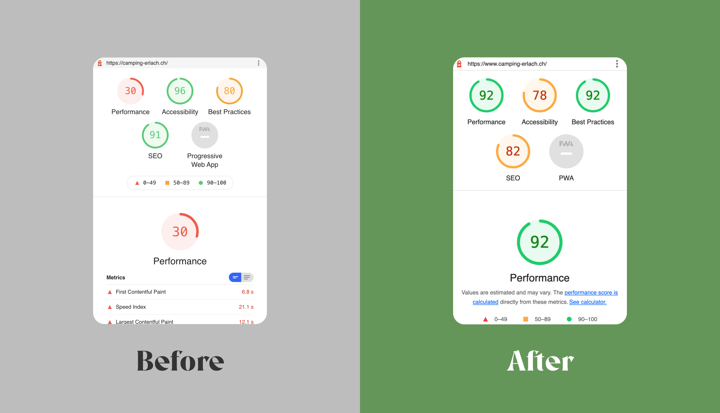
- Journey weight budget: Similarly, we set journey weight budgets to reduce the overall energy consumption of a guest’s journey from landing to checkout.
As you would assume, and our research proved it, images are often the heaviest components of websites. The more images you use and the larger those image files, the more energy is used. So, before even thinking about the technical aspects, our designers asked these questions:
- Does this image add value to the user?
- What is the purpose of every single image?
- Does it communicate useful information?
- Can we make the same impact with a smaller image?
- Is animation or video really needed and meaningful?
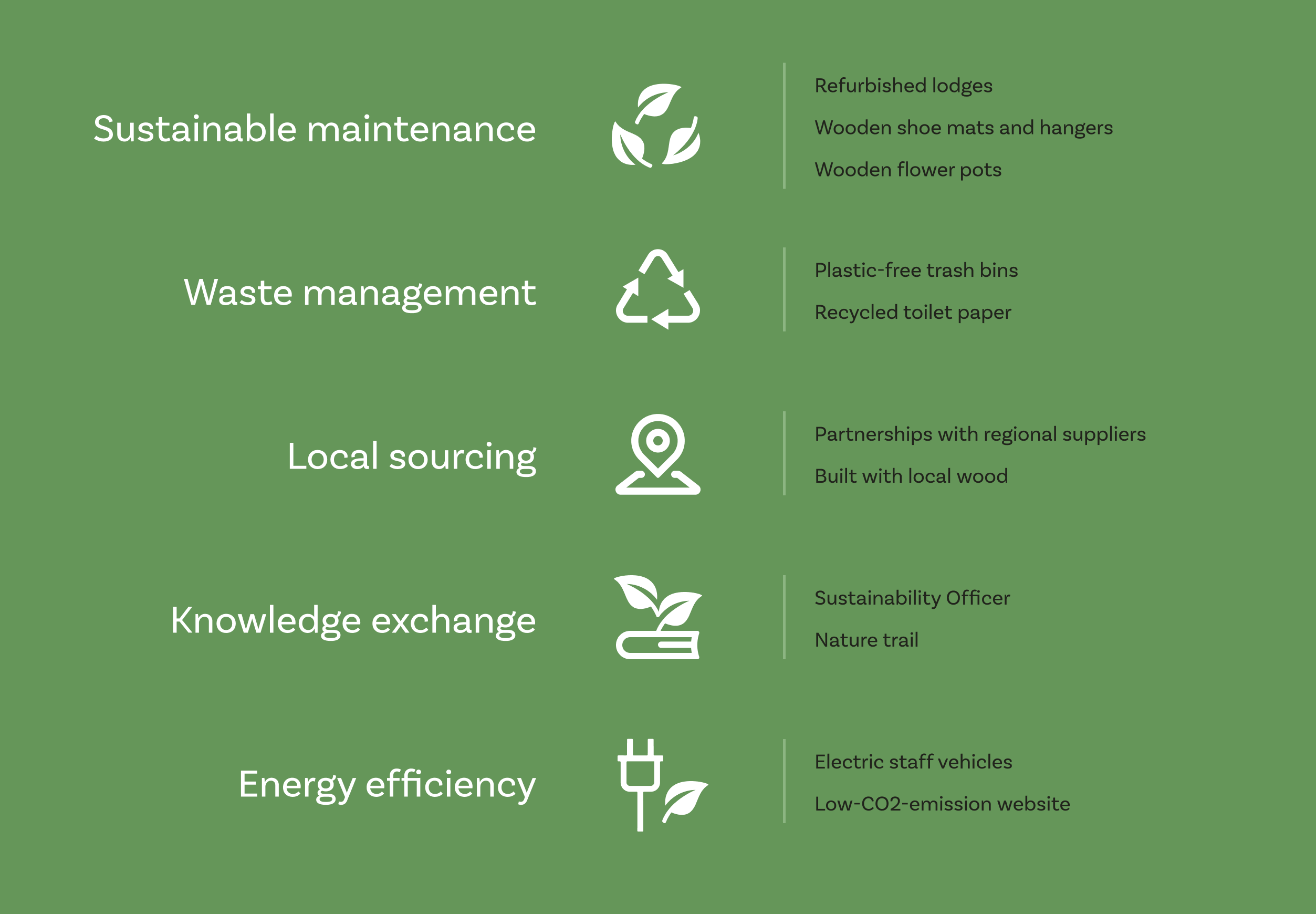
Based on these considerations, here’s what we did on the design side to reduce page weight:
- Not use videos
- Use less and carefully curated imagery, including proper image compression
- Reduce image dimensions and sizes (which had the positive side effect of faster loading speed)
- Mobile-first design
- Fewer custom fonts
- Reuse assets, ideally coded, throughout the touchpoint; utilize design systems
- Content: reduce, compress, optimize (less content, less energy, simple)
Et voilà! Turns out you don’t need a huge website to create a good experience.
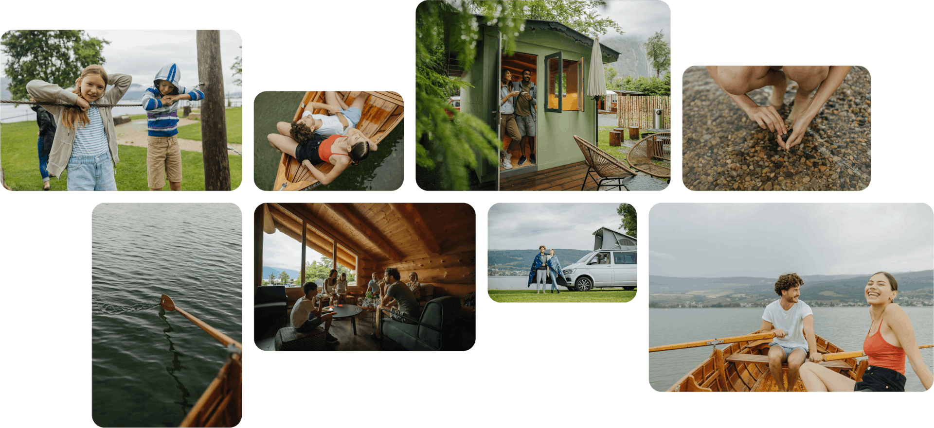
The creative concept we came up with was aimed at creating a compelling emotional atmosphere and giving a glimpse of what staying with Camping Lodge is and feels like. For this, we used a storytelling approach and lots of relatively small images in a photo album kind of stylewe called it Travel Diary, where sites like Airbnb are currently using huge, data-heavy sliders.
Halfway into the project, we arranged a three-day photo shoot onsite to make sure that all the pictures would follow the same overarching style (natural and authentic), giving all of Camping Lodge’s websites a consistent look and feel.
Speaking of natural: A number of UX decisions evolved around giving nature the focus, quite obviously. In order to nudge site visitors to explore sustainable options, we showcased the eco-friendly features of each accommodation type, like plastic-free equipment or local products – while introducing Camping Lodge's philosophy and practice on a dedicated Nature & Us page.
Based on the art direction and content collected, we created the wireframes and site maps. The design is flat, many decisions were made based on whether or not this would be the most sustainable thing to do.
The tight time frame of just eight weeks to bring the three websites to life turned out to be quite a challenge. To speed up the process, we decided to do the development based on wireframesand not wait for the final UI. This reverse process lead to many constraints and the art direction being adjusted later on.
Here are some steps we took on the development side to make the site more energy efficient:
- Write clean code
- Use less JavaScript
- Optimize images
- Optimize fonts
- Use Accelerated Mobile Pages (AMP)
- Build static web pages
- Use Progressive Web App technology (PWA)
We also made some moves toward more sustainable hosting practices. For example:
- For the most impact on the sites’ environmental footprint, we chose a hosting provider that runs on 100% renewable energy
- Use server caching
- Choose hosts with a high PUE rating
- Use a data center close to the users
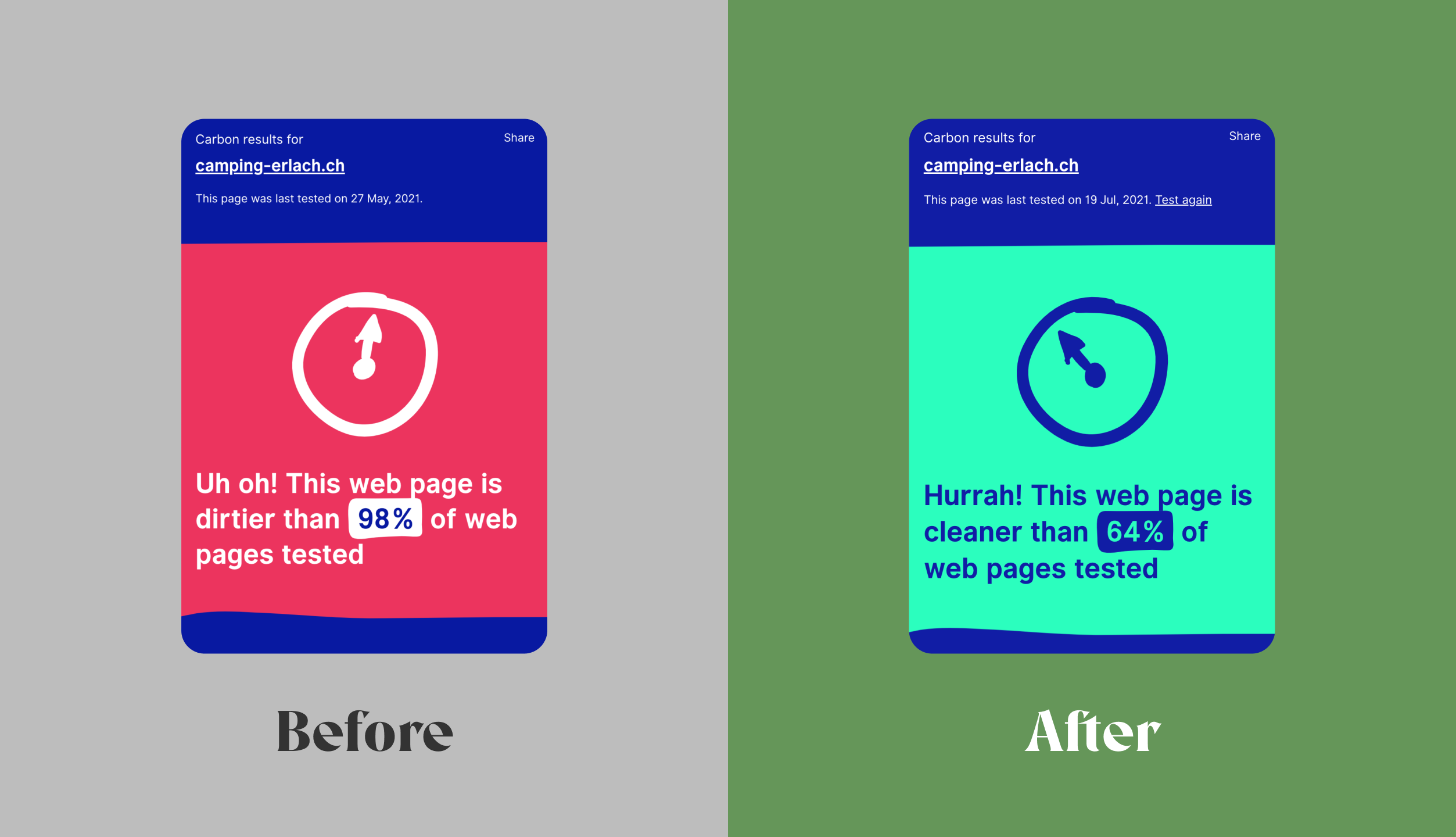
Camping Lodge’s old website caused around 3g of CO2 emissions for every page view. With an estimated 360,000 page views per year, this came out to just over 1 ton of CO2 per year. That's about the same amount of CO2 emitted by a car running on biodiesel and driving 4,500 km — around 36 trips from Zurich to Bern.
With the new site, we cut down CO2 emissions to 0.79 g per page view — equivalent to reducing the number of car trips from Zurich to Bern from 36 to 9. (The actual numbers differ across the three sites, but you get the idea.)
To increase users’ awareness, we added a carbon calculator badge (from https://www.websitecarbon.com/) to the footer displaying a live calculation of each site’s carbon emissions.
After the go-live of the first three websites, we continued to fine-tune the details, making sure that the development outcome meet the design needs. Also, we kept (and keep) on adding new features, always mindful of the core values — simplicity and sustainability.
- Since this was our first-ever sustainable website project: a lot
- The sustainable website movement is young and vibrant, so right now is a great time to pioneer and make a difference
- Essentially, a more energy-efficient website is a better website. Why? Because things you can do to save energy also have a positive impact on a site’s UX, performance, and even SEO
- Europe's largest underground waterfalls, near Camping Jungfrau, have a flow of up to 20,000 liters of glacial meltwater – per second
- Green UX may be constraining, but it doesn't mean we have to sacrifice the experience
- The single most effective way to lower your website's carbon footprint is to choose a hosting provider that uses renewable energy
In Episode 46 of MING Labs’ podcast Lost In Transformation, we talk to Tom Greenwood, Managing Director at Wholegrain Digital, and the creator of the website carbon calculator. Listen to this episode to learn more about the impact and waste of digital products, the mindset shift towards a more sustainable web, and what first steps we can take towards a carbon efficient digital world.
Camping Lodge: Pascal Urscheler – marketing consultant; Tim Müller – marketing manager; René Müller & Jan Vyskocil – founders; MING Labs: Yun Huang, Verena Maier – UX designers; Piotr Zwolinski – technical lead; Andrea Cadorin – art director; Julia Wunderlich – project manager; Marc Seefelder – CCO; Julia Nimke – photographer.